Expertise:
Beginner
How Can I Summarize the Patterns I See Here?
Now that we have functional objects of our observed data, we'd like to summarize the estimated
temperature curves. Climatologists can then use these summaries to talk about typical weather patterns
and about variability in these patterns over time and across Canada.
The mean function is a simple analogue of the classical mean for univariate data. It can be calculated
by averaging the functions pointwise across the replications.
The mean curves plotted on figure 2 show the distinctive patterns of the four climates. For example,
the Pacific cities are much warmer than the rest of Canada in the winter and spring but have fairly typical
summer temperatures. The Arctic stations, on the other hand, have temperatures cooler than the
average throughout the year. (Here we may start to think about how to create analogues of principal components
analysis and linear models to explore these sources of variation.)
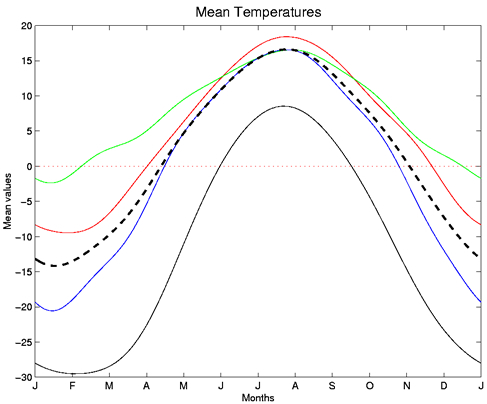
Figure 2: Mean Temperatures
We can also calculate the standard deviation function and correlation function of the data. These functions
are also simple analogues of the classical measures and have similar interpretations. This standard
deviation function plot, for example, suggests that the winter months have the greatest variability
in recorded temperatures across Canada - approximately 9 degrees Celsius, as compared to the summer
months with a standard deviation of about 4 degrees Celsius.
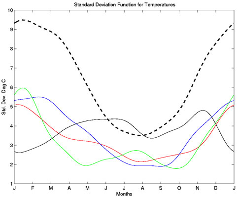
Figure 3: Standard Deviation Function for Temperatures
The correlation function is shown here in a perspective plot. Although perhaps a challenge to interpret
at first glance, this plot can prove useful. Classical correlation (a measure of agreement) is calculated for
a set of paired data. In a functional case, we can calculate the correlation of values at every two points
along the curves - so now we get correlations of temperatures at every two time combinations of the year.
This gives us a symmetrical three-dimensional correlation surface, shown here with larger values in red
and smaller values in blue. The diagonal ridge running from the lower left to the upper right is exactly
one, as is expected - the lower corner, for example, refers to the correlation of January temperatures with
the same January temperatures.
If the weather patterns were symmetric, we would expect the other diagonal to also be identically one.
In fact they're very close to this, except for a few small dips. These dips imply that the spring and autumn
temperatures do not exactly correlate. This we can also see from the mean plots, where the spring
temperatures are on average colder than the autumn temperatures. Not surprisingly, the winter and summer
temperatures have a much weaker correlation of about 0.5.
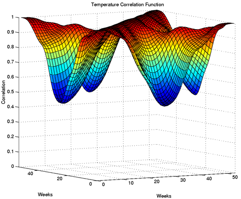
Figure 4: Temperature Correlation Function
|